The Risk-Return Diagram: The Most Important Chart in Finance
In the financial world, there is a fundamental trade-off that every investor must understand: the relationship between risk and expected return. There's a simple but powerful diagram that visualizes this relationship and forms the core of Modern Portfolio Theory (MPT).
Anyone who builds portfolios or compares strategies must understand this concept.
The Two Axes: What You Need to Define
Before we examine the chart, we need to understand the two axes it represents.
1. Return (The Y-Axis)
Return is the simplest part. It measures how much profit (or loss) an investment has generated over a specific period, expressed as a percentage.
- Definition: The (expected) percentage change in invested capital.
- Goal: Logically, investors want to maximize returns. This forms the vertical Y-axis in the diagram.
2. Volatility (The X-Axis)
Volatility is the price you pay for the chance of returns. It's the standard measure of risk in the financial world.
- Definition: Volatility measures the range of fluctuation of returns around their average value. High volatility means that prices swing strongly and unpredictably up and down (high risk). Low volatility means stable, predictable prices (low risk).
- Goal: Investors want to minimize volatility. It forms the horizontal X-axis.
The Risk-Return Diagram
When we plot every possible investment (stocks, bonds, ETFs, or entire portfolios) based on these two metrics in a diagram, we get the risk-return diagram.
The diagram visualizes the central trade-off:
Assets with high expected returns (top of the chart) tend to also have high risk (right side of the chart).
Assets with low risk (left side of the chart) tend to have low expected returns (bottom of the chart).
The ideal investment would be top-left (high return, low risk). However, this doesn't exist in reality – this is often referred to as the "Free Lunch" that doesn't exist.
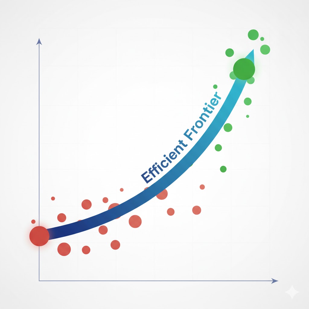
The Efficient Frontier and the Feasible Set
The most important insight from this diagram is the Efficient Frontier, which you can see as the blue line in the interactive chart above.
Imagine plotting thousands of possible portfolios (combinations of different assets) in the diagram. These form a gray point cloud - the so-called "Feasible Set" (achievable set). Each gray point represents a possible portfolio with its specific risk-return combination.
The efficient frontier is the upper edge of this point cloud - the curve that connects all optimal portfolios.
Understanding the Feasible Set
The Feasible Set (the gray points in the chart) shows all theoretically possible portfolio combinations. Key insights:
- Each point = a portfolio: Each gray point represents a specific mix of different assets
- All points are investable: These combinations can be implemented in reality
- But not all are optimal: Only the portfolios on the blue line (efficient frontier) are truly efficient
What Does "Optimal" Mean?
A portfolio on the efficient frontier is "optimal" because it fulfills one of two conditions:
- Maximum return for given risk: It offers the maximum possible return for a given risk level.
- Minimum risk for given return: It offers the minimum possible risk for a given return level.
What Does "Inefficient" Mean?
All portfolios that lie below the efficient frontier are inefficient. (Like the red point "Inefficient Portfolio" in the chart).
Why inefficient? Because for the same risk (14% volatility), there exists another portfolio (higher up on the curve) that offers a higher return (9.7% instead of 7.5%). In other words: you're taking on more risk than necessary to achieve your return.
Conclusion: What the Diagram Teaches Us
-
No return without risk: The diagram visually shows that higher expected returns must always be bought with higher volatility (risk). There's no "Free Lunch" in the stock market.
-
Diversification is the way: Portfolio theory shows that through clever combination of assets (diversification), you can create portfolios that lie on this efficient frontier. A single asset is rarely as efficient as a well-diversified portfolio.
-
Find your point: As an investor, your goal is to find a portfolio on the efficient frontier that matches your personal risk appetite. A conservative investor chooses a point on the bottom-left of the curve, an aggressive investor chooses a point on the top-right.
💡 Tip: Want to analyze your own strategies? On totallynotrich.com you can calculate and visualize the volatility and returns of your investment strategies.